
Urban Heat Democratization · Research wiki
A Practical Graph-Theory Example
Follow four map cells from a simple connection diagram to a careful, useful public question—without needing advanced mathematics.
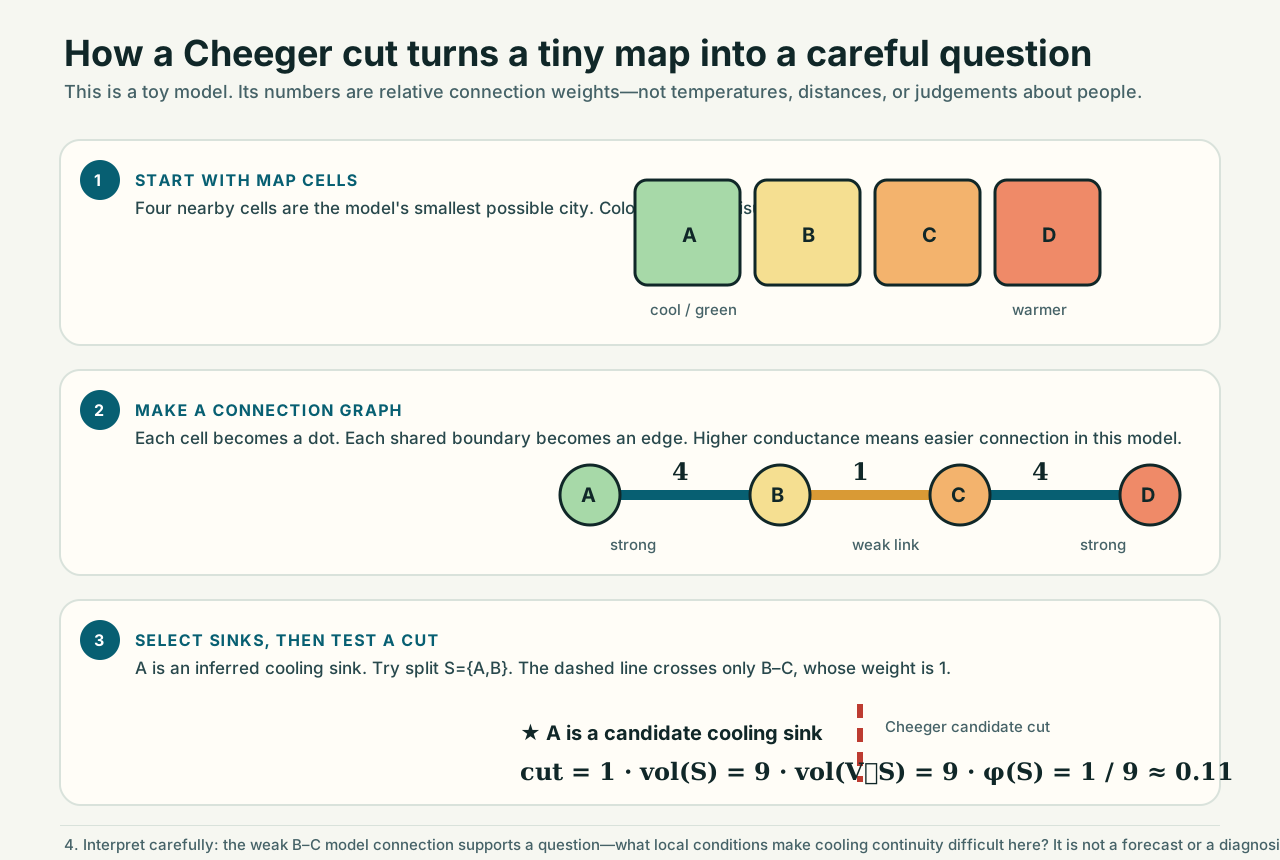
A tiny city map
Imagine four equal map cells along a route to a shaded park. A is a candidate cooling sink. The numbers are relative conductances: larger means the model treats a connection as easier.
The B–C link has weight 1; the outer links have weight 4. The number is not a temperature, distance, or judgement about people. It is one stated model assumption.
Find the seam
Put A and B on one side of a proposed split, S={A,B}. Only one edge crosses to the other side: B–C, with weight 1. The weighted degree volume on each side is 9, so the conductance is:
That small result says the halves are weakly connected in this four-cell graph. If the B–C connection were changed from 1 to 4, the result becomes 4/12 ≈ 0.33: the seam is less pronounced.
Translate math into a public question
The graph does not say that a place is dangerous, that residents lack cooling, or that a project will deliver a stated temperature reduction. It shows why this connection deserves careful local investigation. Read the longer repository worked example or return to the canonical platform.
Explore on the Canonical Platform
Connect this research guide to live interactive modules on urban-heat.ai-aarti.com:
Inspect satellite thermal layers, bottleneck cuts, and localized cooling access.
Explore transparent what-if cooling options, budgets, and equity trade-offs.
Interactive OSM queries, microclimate sensor bench, and federal grant generator.
Model reflective roofs, urban canopy, and cool pavements with live feedback.
Explore spectral graph conductance, Fiedler vectors, and percolation dynamics.
Partner with research mentors, community advocates, and public agencies.